Monday, October 31, 2011

happy halloween


Have a very scary halloween!

Come back later for an update on all of our progress this weekend- its so amazing its spooky!


Tablescape via Martha Stewart

Thursday, October 27, 2011

guest post: innovative kitchen lighting

today I am excited to share with you our first guest post.  today's post comes from Jenn at Arcadian Lighting and I happy to say she is writing about innovative kitchen lighting.  this is an area that i have yet to think too seriously about.  however, i am stoked to see such interesting lighting choices and i can't wait until the time comes that we are picking out the lighting for our house! enjoy!

Hi there! I'm Jenn and I write for Arcadian Lighting, an e-commerce website that specializes in top lighting trends from across the globe. I've been writing about home decor, antiques, lighting fixtures, and more for years, and I love blogs like W Design Studios, where they share expert knowledge and inspiring ideas with the masses. I was so excited to find out I'd be writing here today and I hope everyone enjoys my guest post on innovative kitchen lighting. Almost every type of light fixture can be used in a kitchen, from inset spotlights to grandiose chandeliers. As long as it's in keeping with the theme of the space, whether that be modern or traditional, innovative lighting for a kitchen is always a hit. Here are eight great spaces with creative lighting.
 
Utility lighting


Innovative Kitchen Lighting
  While it may be an unconventional choice for a kitchen, this utility desk lamp looks industrial and stylish over a sink and open shelving.

  Pot lights everywhere


Innovative Kitchen Lighting
The incredible thing about pot ceiling lights is that they're subtle in their installation however their effects are always dramatic.

  Unique tracks


Innovative Kitchen Lighting
These track lights are particularly unique in that they are suspended with different type of track lights, giving this kitchen a visually-appealing feature.

  Cabinetry under-lighting


Innovative Kitchen Lighting
In a kitchen with clear cabinet doors it's important to take advantage of this showmanship quality and light the accoutrements from the inside-out.

  An eclectic chandelier


Innovative Kitchen Lighting
Sometimes innovative lighting for the kitchen can be the entire focus of the space, as seen here in this classic kitchen with a very modish chandelier fashioned out of candles and crystals.

  Coloured domes


Innovative Kitchen Lighting
Pendant lights in a solid color are the perfect kitchen lighting to pack a powerful punch in a monochromatic kitchen like this. They appear raw and organically strung from thick chains.

  A spider of spots


Innovative Kitchen Lighting
Like a modern arachnid spreading its creepy legs, this black fixture is strange and yet stylish all at once - the individual lights can be pointed at various points of the room for optimal lighting.

  A cluster of glass


Innovative Kitchen Lighting
Coloured glassware may be the focal point of the space however it's the unique pendant light†of clear and frosted glass pendants that really glam up this kitchen.

 Images: | 1 | 2 | 3 | 4 | 5 | 6 | 7 | 8 |

 Did you get inspired by these lighting ideas for the kitchen? Comments are welcome! Don't forget to check out Arcadian Lighting's blog for more innovative light fixtures and inspiration!

Wednesday, October 26, 2011

big plans: the house reveal

i have been waiting to reveal the elevations of our house until a very special package arrived in the mail.  well it came on monday afternoon and now i am so excited to share it with you!  my grandfather , elwood cooke is an architectural renderer.  for many years he made a living creating paintings of structures for builders, developers and individuals.  he has painted countless buildings and homes for people in the dc area and he was kind enough to paint our house.  he did a fantastic job, and we couldn't be happier.

a rendering does wonders for a project.  it is something that people can understand.  plans and line drawings are informative but they don't give life to a project.  i sent elwood the plans and a front elevation of the house a few weeks ago, along with a package of material samples.  after several phone conversations regarding the material placements, landscape ideas and a few tweaks in the exterior detailing this is what he came up with:

elwood cooke- dunkirk, maryland


if our house turns out as beautiful as elwood's rendering then björn and i will be so super stoked!  we are so pleased with the proportions of the two structures and the addition of the garage creates a nice balance of materiality.

the main house which contains the bedrooms, bathrooms and utilities will be clad in old barn wood while the small house, which is the great room and dining wing, will be clad in painted siding- probably pine in a blue-grey color.  we decided on vertical siding for each of these two wings to emphasize the height.  the white trim will provide some nice contrast and emphasize the geometry of the houses.  the kitchen "connecter" in the center of the house will have horizontal painted siding to keep that area as light as possible, since it will be in shade most of the day.  other materials include the raised seam metal roof in a beautiful oil rubbed bronze color and the window mullions are harvest red.

from the rendering you can get an idea of the landscape plans.  because durango is a dry climate we are interested in xeriscaping.  i can't wait to plant aspen trees and some other beautiful shrubs around the property and we have some beautiful rocks that we have saved from the rock wall for landscaping the front.

now that we have this rendering the reality of this project seems closer than ever.  i can't wait until the foundation is finished! i hope you like it and i would love to hear your comments!


Tuesday, October 25, 2011

LEED For HOMES: LL Location & Linkages

this is the second post on our LEED goals and it concerns location and linkages.  the intent of this particular group of goals is to reduce the impact of land development practices.  this means simply developing in areas where infrastructure is already existing, and developing on lands that are not environmentally sensitive.

the first requirement concerns the 100-year flood plane.  our site is next to the animas river so consequentially the 100-year flood plane is a real concern for us.  as you may remember i thought i was getting a giant basement for storage, and a wine cellar here.  however, do to the FEMA 100-year flood plane levels we are no longer having a full basement.  rather we are having a crawl space which sits one foot above the flood plane.
durango GIS map with FEMA flood plane levels

the second requirement is that we are not building on any endangered wildlife habitat.  i don't believe we are and considering the city hasn't given us any grief about cute little animals i think we are safe on this one.  we do have some resident deer that like to hang out near the property.


this land wasn't public parkland prior to our ownership- check and we don't have any unique soils of any geologic significance- check.   we are within 100 feet of water and LEED recommend that no development occur within 100 feet of any water source- so i guess we aren't getting those points.

we will get points for developing on a piece of property in which 25% of the adjacent perimeter is previously developed.  the house to the south has been around for over 50 years so point for us!

the fourth point concerns the projects location within an existing community.  it is advisable to develop on a property which already has close by city services such as water, sewer and power.  our site is within 200 feet of all of these services so we are well within these limits.

LEED also commends projects that are within close distances to services such as a grocery store, banks, restaurants, and schools as well as transit services.  our site can qualify for the maximum points as we are within 1/2 mile from at least 14 basic community services.  we are also within 1/4 mile of two city transit routes which services most of durango.  three points for us!

the durango public library and bike path along the river- just minutes from our house!
and finally my favorite, open space.  LEED commends development that has close access to open space.  durango has done a pretty good job of creating open space for its residents. we are within 1/2 mile of several public spaces that are over 3/4 acre in size including access to a superb bike path through town and some very cute little parks.  we also have a river put in just up the street from our lot which is a nice spot for rafters and kayakers- another point for us.

overall out of a maximum of 10 points we should easily get 6 points, not to shabby considering we are building next to a water source. but you know what- i will sacrifice a couple of points for the river view and the awesome spot we have!

our river the animas


Monday, October 24, 2011

progress report: doing it egyptian style

sorry for the late post today, the weekend was full of organizing tools, digging big holes, and using fun gadgets!  here are a few pictures of what we were up to.  we created an "egyptian water level" using 60 feet of clear plastic tubing and water.  the egyptians used this type of technology to build the pyramids so it must be good enough for björn and i.

the water level

the pencil just plugs the two ends as we move around

we knew the elevation at the curb from our survey so one end was held at curb level and the other was stretched across the property to a stake.  water doesn't lie and is always level so the height was marked on the stake.

the stake was marked and this became our baseline for all the other information we needed.  

we then checked all our work using a high tech laser level.

we constructed batter boards to mark the points that will remain in place during the excavation phase

our water level was super accurate, within 1/8"!  those egyptians were pretty clever folks!

if you want to learn more about water levels or egyptian levels check out this article from Fine Home Building.  the laser level is an awesome tool as well, we borrowed a Bosch laser from Carll Construction (the guys building the rock wall).

Speaking of the rock wall here are a few photos of the progress the guys have made! we are so happy with the look of the wall and the awesome space that it is opened up next to the river.  this area is sure to be one of our favorite spots on the property.

i love that we used varying sizes and shapes for our boulder wall.  

looking down the wall toward the river.  lots of interesting ledges  and spaces are created to
put potted plants and hopefully get something to grow down the sides of the wall.

this area will eventually have stairs up to the house level.

finally this weekend we actually started the excavation!  after setting up our batter boards and finding the ground level as well as several other levels such as the top of foundation level, etc.  we staked out the house and began the rough excavation using the back hoe.  we are hoping to finish up digging today and start compaction tomorrow.


Friday, October 21, 2011

happy weekend: ms. de generes and ms. de rossi

i don't know what your opinion on ellen degeneres is but i think she is funny, smart and has some great style.  and who knew she was obsessed with real estate hunting and interior design.  architectural digest has just published an editorial on the couple's beverley hills home in their november issue- pick one up!  here is a sneak peek of some of their beautiful spaces!


the entrance hall complete with ping pong table!

the living room- love that ruth asawa scuplture hanging in the corner

pretty porch dining area

the tranquil pool


i hope this weekend is lovely for you!  i am going to catch up on some reading, looking at design magazines and continuing to draw up ideas for the interiors of our project!


all photos via architectural digest

Wednesday, October 19, 2011

products galore: whats in my bag

so i have been playing around with polyvore for the last day or so and i decided i would create my own "whats in your bag" post.  i always think its interesting to see what people really carry around in their bags, mine isn't very thrilling but it is definitely the bag of a designer, complete with an architect scale.  hopefully tomorrow i will have something a little more design oriented but for now enjoy!


whats in my bag


Tuesday, October 18, 2011

big plans: the second floor

i have yet to show you all of the plans for this house.  you have seen the kitchen here, and the foyer and great rooms, here and here, however there is a whole second floor waiting to be explored.  the main reason for not having shown you this space until now is that i haven't even begun to narrow down what these rooms are going to be like.  i have so many ideas floating around in my head, some of them outrageous, others seem too tame and "boring".  we just don't know exactly what direction these rooms will take.


to get to the second floor you must asend our beautiful stair, which you saw here.  this area has light coming from three sides, so it should be a very dynamic space, paired with the high ceilings of the second floor it will be quite dramatic..(.err we hope).  upstairs are two bedrooms and a bath.  the rooms are open and spacious with soaring ceilings just begging to have some decorative element applied to them, but what?  rustic, hand-hewn beams, beaded board and beautiful trim work?  we just don't know!


the bathroom is another story!  we decided that the bathroom will be a little quirky.  as you can see in the plan below, the bathroom is a long, narrow space.  it starts out with 6'6" ceiling height along the exterior wall and goes to about a 12' ceiling along the interior wall.  the soaking tub and shower will become one "room" that is completely tiled with a large skylight.  björn and i are thinking of this space as its own light box.  the rest of the bathroom will be tiled floor and some kind of wall treatment, again, don't ask me what but something awesome i assure you.


the second floor plan


i am working on tweaking the interior plans to add closet space to the master bedroom and the bath so this plan isn't exactly right but you get the picture.  the master bedroom looks over the river and will have some terrific views up the valley to the north.  the front room will get the morning light as well as some views to the north!  overall, i think either of these spaces will make beautiful bedrooms.  below are a few photos that are inspiring us right now, oh and any ideas are certainly welcome!


i love the simple 1x2 trim that frames out this vaulted ceiling

high panelling and a blue ceiling is always dreamy

i love this wood panelling, the wall color, the simple roman shade

hand hewn beams...humm

pickled oak panelling with some mountain chic decor

i love the industrial look of these beams, and the rug and...


photos via house beautiful


Monday, October 17, 2011

big plans: laying strong foundations

"a successful man is one who can lay a firm foundation with the bricks others have thrown at him"
- David Brinkley
i think this is a great quote for our project, we will be successful as long as we continue to make good choices and to take things as they are thrown at us, especially now as we are getting into the real building process- the foundation!

this week the boulder retaining wall continues, we are waiting on finding some decent rock for steps, but the guys should finish up sometime later in the week.  björn is also planning on starting to dig the foundation.  we still have the back hoe for another 15 or so days, which should be plenty of time to dig a really big hole!

because of the type of soil that we are on the foundation type has changed several times as we have learned more about the soils, and also about the flood plane.  due to some changes in the FEMA 100yr flood plane data we are now required to bring our foundation up above that level.  so remember that awesome basement i was going to get here,...yeah not anymore.  cest la vie, now we are going to be building what is called a mat foundation.  


our guys wonderful guys, Tucker and Dave, at Wilson Structural Engineering have been so patient with us as we try to understand the issues that we may be facing.  (and to understand what the heck we are doing)  they have designed a foundation which to me seems a lot like a thick slab on grade with stem walls.  now if you know anything about physics (not that i do by any means... i did get a D in physics) having a slab will spread the load over the entire foot print of our house.  this is a good thing!  if there is any settling due to unstable soils in the future, our house will be minimally effected, if at all!  with the addition of the stem walls we have now created a crawlspace below the house so that electrical, plumbing and other such things will be a cinch!


this is a detail of what our foundation will look like in section

coming up this week:

  • retaining wall completed- hopefully
  • björn begins digging foundation
  • whitney to start talking to cabinet manufacturers


Saturday, October 15, 2011

happy weekend: must-see films starring architecture & design

happy friday....


i was so excited to stumble across architectural digests picks for their top films featuring architecture & design in a starring role.  i have had the chance to see many of these films & for most of them i definitely came away thinking that the set design was fantastic.  a few like the 2010 film, Ghostwriter, i have not had the opportunity to catch but i think maybe björn and i will have to take some time off this weekend to check a few more movies off of this list.  see the full list here


Blade Runner


Breakfast at Tiffany's


The Fountainhead


Ghostwriter


A Single Man


Something's Gotta Give


The Graduate


The Thin Man

Friday, October 14, 2011

happy weekend: yard sale

this weekend björn's mom and i are having a yard sale to hopefully clear out some space in her house.  it should be fun to see how much money we can make selling some of her antiques and little knick knacks.  hopefully we make enough to go to one of the many hot springs in the area.  we have talked about going to a particular hot spring in new mexico which is known for being very nice called ojo caliente.


The Ojo Caliente Ironpool


here are a few pictures of what we did this week and an update on the retaining wall progress!


more rocks were delivered

a friend, justy, stopped by for a visit.  we found out her owner lives across the street

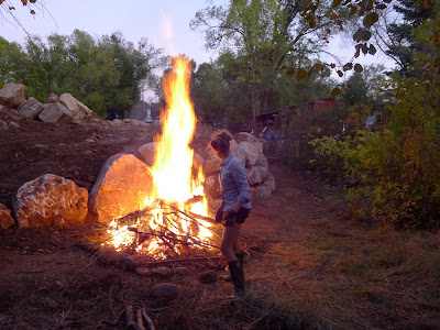
we had a bonfire to get rid of more brush

thats our boulder wall in progress


{SHARE IT}

Related Posts Plugin for WordPress, Blogger...