the kitchen is a very special place for björn & i. we spend a lot of time in the kitchen cooking, reading, it really is the place where we most enjoy hanging out. so this kitchen has to be good. it is also the center of the house, literally. as you will find out, the design is essentially two wings with the kitchen as a connector between the greatroom / dining wing & the bedroom / utilitiy wing. we also knew that the kitchen needed to have a view to the street as well as open onto a patio overlooking the river.
i thought it would be cool to show those of you not familiar with computer drafting programs just what the drawing looks like on my screen so i took a screen shot of the kitchen.
 |
| Screen shot of our kitchen plan. |
the different colors are associated with different line weights & different building items, walls, fixtures, cabinetry, etc. we wanted to create a functional space & i wanted to keep a lot of symmetry on the wall facing the street with the refrigerator & tall pantry anchoring the wall & windows in the middle over the sink.
the main work zone is on the island which will have a prep sink, along with plenty of space for chopping, & rolling out pastries. the island will be perfect for informal dining & keeps everyone in the kitchen engaged with the chefs! behind is the stove & cabinets to house plenty of kitchen gadgets! the ceiling in this space is vaulted with an 11' roof peak which i hope will make the space feel very expansive.
here is the plan with a few notes explaining the different areas!
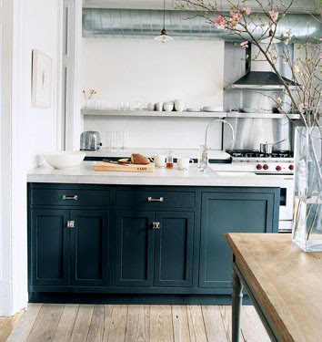
we haven't chosen any materials yet but i have collected many photos for inspiration that we are excited about. there are so many decisions that come into play when building a house, especially in the kitchen. while we haven't decided on much, we have decided that we love the Ralph Lauren Home color Surrey for the island at least, if not for all of the lower cabinets. you can see that color here in Jenna Lyon's kitchen.
 |
| Jenna Lyons' kitchen via Habitually Chic |
i think our kitchen will end up being mostly white, with the dark blue island anchoring the room. i would love to see a really interesting ceiling treatment & i think the light fixtures will be an opportunity to add some style and playfulness to the space. here are a few other photos that I have been collecting that are inspiring our kitchen finishes! enjoy!
 |
| RL Home director of Communications kitchen via Elle Decor I love the symmetry in this kitchen, & the white! |
 |
| beautiful James Radin designed kitchen via House Beautiful. i love the classic look of this kitchen |
 |
| martha stewart's cappuchino bar via Martha Stewart love this! |
 |
| unknown via The Fresh Cottage i think i like the light fixtures in this kitchen, again white & the beams are cool. |
 |
| unknown via some minneapolis real estate magazine? love everything about this kitchen! |

No comments:
Post a Comment