Wednesday, February 22, 2012

products galore: hardwood floors

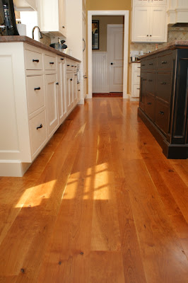
 we are the luckiest people in the world, and maybe the most spoiled people we know.  the flooring in our entire house is essentially going to be beautiful solid cherry hardwood.  i know, sounds extravagant and expensive.  well is wasn't cheap to be sure, but it wasn't really anymore than buying an engineered hardwood from home depot, we got the deal of the century.  i just looked at prices for engineered hardwood on home depot, they range from a low of about $3.00 to a high of $8.00.  and solid hardwood generally starts around $3.85 for very thin plank stuff and goes up from there.  cherry hardwood floors...forget about it, most of the cherry out there is brazilian cherry which doesn't seem very sustainable to us.

we actually purchased our cherry floors a year before we even had a house design.  we had another house designed that we were going to build in a different location, that all fell through but we still had a deposit on about 2000 sf of flooring from Hull Forest Products in pomfret, CT.  so if you are like me you are thinking connecticut is a long way from colorado, and it is, however, we really liked the way that this particular company works.  they have been dedicated to using trees from sustainably, and responsibly managed forests.  all of their wood is local to the new england area, no brazilian jojoba here,  and Hull offers management of private lands to ensure that all the forests are preserved for future generations. plus like i said we got the deal of a lifetime!

we are getting a wide plank floor for about $4.85 a square foot.


beautifully wide plank cherry

we will have wood in our baths as well- with tile in the wet areas

our cherry will have some knots to give it that farmhouse look


a serious glamor shot of our premium cherry hardwood

Hull Forest Products has many other species of wood and also sells wood timbers, lumber, and wood chips, nothing goes to waste! They are always running specials on certain products so check out their sale page!


photos via hull forest products


Tuesday, February 21, 2012

products galore: epic faucet

björn and i scored big time a couple of weekends ago.  we discovered this great warehouse here in durango that a local contractor has started to sell salvaged building materials.  he not only has some very interesting things he has amazing prices as well.  well we were poking around looking at a lot of stuff speculating out loud at how useful and cool many of his items are.  he has a super cool vintage ice box that was salvaged from an old durango liquor store, lots of old timbers and several interesting sinks and fixtures.

suddenly both of us zeroed in on a lone faucet sitting on a shelf.  immediately i thought to myself, this is way cool.  i could just tell from the construction and the material that it was high quality and as soon as i touched it björn said "yes, how much?!"  the guy must have also recognized that this was something worth a little bit of money so while most of the other fixtures and items he was selling for $10 or $15 he said that he would take $75.00 for this faucet.  a huge price jump from his other merchandise but björn and i knew that it would be worth it so we said we would take it!

so here it is:

the porcelain handles work perfectly

björn and i both recognized this was a high design faucet

me being very curious went immediately on the internet when we got home and did a quick little search for this french faucet.  and to my surprise i found it, the company Herbeau, is still producing this product and had we wanted to buy it for our house we would have to pay : $1,113.00 plus taxes and shipping I would imagine!  and we got it for $75.00!  i would say thats a pretty good deal, we would NEVER spend that much money on a faucet, we may dream, but that is outrageous.  lucky for us someone in Telluride, where this faucet was salvaged from, thought nothing of ripping it out during their renovations.  just to prove it to you here is a screen shot from the Herbeau website:


we plan on using this fixture for the island prep sink, i think it will look amazing as you walk into the kitchen and i think it ties into that clean lines farmhouse look we are going for.  now we just have to find the rest of the faucets for the house which may be hard now that we have to live up to beauty!


Monday, February 20, 2012

vacation time: ambergris caye, belize

we are headed to the beautiful island of ambergris caye off the coast of belize today for a much needed vacation to some warm tropical weather.  björn and i have been looking forward to this for a few weeks now and in preparation for the trip I have been working on my scuba certification through padi.

i have a few posts prepared for the next few days so i hope you enjoy!  is anyone planning a vacation soon?  see you in march!

i will be spending as much time as possible soaking up the warm sunshine


the water in ambergris caye looks absolutely amazing
 and the coral reef starts just 1/2 mile off shore


this should be me swimming with the fishes!


all photos via ambergris caye.com

Friday, February 17, 2012

progress report: electrical work part 1


björn and i are doing our own electrical work.  to be perfectly honest we really knew nothing about electrical before we started this project but we have been so lucky to have a mentor.  david morris is a certified electrician and he has been so awesome coaching us through the process of setting up our electrical system.   we have been busy running all of the wires to the electrical boxes the last couple of weeks and we are now working on the switches and lighting. i am going to breeze through these topics but just so you know there is a lot of information so i expect this will be part one of a series of electrical posts.

our friend david morris doing what he does best (telling us what to do)

there are many codes that govern electrical work, but the basic concepts of electrical are fairly simple.  the first rule is the 6/12 rule, this applies to most spaces throughout the house and it states that within any living space you must have at a minimum, an electrical outlet (receptacle) within 6 feet of a break in the wall (ie a doorway) and then no more than 12 feet from the previous outlet.  this rule is all based around the standard length of cords provided on "living area devices" (floor and table lamps)

a simplified diagram of the 6/12 rule from here

to begin our layout for the electrical i started with our floor plan and created an electrical plan.  this is a good way to start because you can get a feel for the layout of each room, and where furniture might be placed.  this helps you to layout where you need outlets functionally and then you can apply the 6/12 rule to make sure you are meeting the minimum requirements, you can always have more.
first floor electrical layout example

we then took my general layout and applied it to the actual house.  because of the SIP walls we decided to move some of the outlets to match up to locations in the SIP walls where there was a pre-drilled electrical chase through the foam.  this was to make our life easier when we started running the wires.  all of the electrical boxes in general are installed at 16" to the top of the receptacle box, this is a standard height, and is also the height at which the horizontal chases through the SIP panels are drilled for convenience.

in the upstairs back bedroom i placed outlets on either side
of a potential bed location

björn and i went around and placed all of the outlets for the living spaces, this includes the foyer, living room, dining room, and bedrooms.  the kitchen and bathrooms have a whole different set of rules that apply.  in bathrooms there is only a requirement for one outlet that must be within 3 feet of the sink basin and must also be a GFI outlet.  this means ground fault interrupter, the short definition is that a GFI outlet monitors the amount of current flowing from "hot" to "neutral" (electrical terms) and if there is an imbalance it trips the circuit.  this is to protect you when you drop your electric razor into the sink filled with water or "accidentally" throw the dryer into the bathtub. the GFI will sense that something is wrong and trip the breaker so no death by electrocution.  these are required in all bathrooms, some kitchen outlets and some outside receptacles.

in the kitchen the outlets are placed above the counter and also must be GFI type outlets.  however, instead of the 6/12 rule kitchens have an outlet at every counter top measuring more than 12" and then outlets must be placed every four feet.  this is because it is well known that kitchen appliances have teeny tiny cords.  there must also be at least one outlet for any island counter, as well as outlets on any walls without cabinetry and these fall under the 6/12 rule.  björn and i also placed outlets for the refrigerator, dishwasher and garbage disposals, and the stove.


this explains the kitchen layout rules pretty clearly from here

the refrigerator gets its own dedicated outlet

some of the kitchen receptacle boxes

thats all for now on electrical, while the concepts are not hard to understand there are a lot of rules so feel free to check them out at the National Electric Code website.  they have a lot of great information, and i encourage everyone to explore doing their own electrical improvements in the future.  its not rocket science, just be careful!  i will be back to talk about circuits and how we ran all of the wiring next!


Wednesday, February 15, 2012

products galore: kitchen counters

i have no idea what to do for our kitchen counters.  there are so many choices available to consumers that it makes deciding a very difficult process of elimination.  i think the most important features of a kitchen counter are, ease of maintenance / cleaning, durability and looks.

i have been reading about all types of solid surface products, these are typically products that are made up of an acrylic resin.  within the group of solid surfacing are many different manufacturers all with slightly different looks, however Corian by Dupont, is probably the most well known.  it is non-porous and stain and chemical resistant which makes it a great choice for medical and food-preparation areas.  i like the idea of this product being super sanitary and easy to clean, however it is not known to stand up to heat very well because it is essentially plastic.  but i like some of the different looks that Corian has so i think solid surface is still in the running.

Rain Cloud from Corian Private Collection

Arrowroot from Corian Private Collection

Beautiful Corian countertop via Houzz

I love how thick you can make Corian
 look like on this solid white island via Houzz

another serious contender is the engineered stone that is available on the market today.  people are OBSESSED with granite, you watch any of those HGTV shows and every person says "oooh granite counter tops" as if that instantly makes a space more classy, regardless of the layout or the fact that they are probably looking at THE cheapest granite money can buy, but anyway (yes, I am kind of a granite hater)  the types of granite i love are waaaaay out of my price range and come from exotic locations in africa and europe so instead i am seriously considering an engineered stone.  these have all of the great qualities of granite- stands up to heat well, easy to clean, beautiful movement but can be made in large slabs at a lower cost than the real stuff.  all of these engineered stones are basically the same make up of 93% quartz and 7% resin, and because it doesn't need sealing it is lower maintenance than granite! yay for me!

don't get me wrong, there are plenty of granites out there that compete or even beat the price of engineered stones, but these are your typical santa cecilia or tropic brown or that gold color that ever new condo in the world seems to have.  (ive been drinking the hater-ade i know) products like dupont's zodiac, silestone and caesarstone all have a variety of colors and styles to choose from ranging from almost solid to pieces with tons of movement and color.  here are a few i am liking right now:
zodiaq cloud white
zodiaq bianco carrara- made to look like carrara marble 
silestone - bianco river

i love this silestone because it reminds me of concrete- color cygnus

silestone lagoon

white zodiaq counters via houzz

finally i am looking into concrete counters.  this is a real source of anxiety for me, i have heard great things about concrete and terrible things about concrete.  on the one hand i know that is stands up to heat, and cleaning really well and i love the industrial look of it, on the other hand i have heard about wine stains,  and oil spots that never go away.  i just don't know what to think!  our neighbor actually makes a living pouring concrete counters so i think i am going to go question him and get the run down.  in the mean time i have been eagerly looking at this company sonoma cast stone to get ideas as well a pouring over the internet for photos, here are few that show off the style of concrete i like.

beautiful bath with concrete counters and surround via houzz

a picture everyone has seen of jenna lyon's concrete counters via houzz
(still chic though)

beautiful kitchen with sleek concrete counters via houzz


Tuesday, February 14, 2012

Opinions: The Animas River Dilemma


The following article appeared in The Durango Herald on Sunday February 12, 2012.  It was written by our friend and neighbor, Sam Burns, concerning the Animas River Management Plan and the craziness that is the 33rd street river put-in.  This area is just about 500 feet north of our new house so Björn and I have taken an interest in the development and management of this area.  Durning the summer months our quiet neighborhood street becomes a carnival of rafting buses, tourists, and individual tubers.  While many river users are respectful and wonderful, there are also many who are not so neighborly.  Our street fills with cars, people changing in our front yards and even using our property as a restroom or trash receptacle.  

Durango Parks and Recreation has held several meetings in the last few months in order to get the input of the community to come up with a river management plan.  Björn and I have been involved in these meetings as we have a desire to see our put-in developed to work better for everyone but also to preserve valuable riparian habitat and to encourage respectful use by everyone.  As you can see from Sam's article the commercial rafters have pit themselves against adjacent property owners in order to create drama and a rift between the two groups.  The next workshops are this week and I hope that we can attend to make sure our voices and ideas are heard!
The 33rd Street put-in, just up from our house via Jane Gurstenburger


A shared asset

Access not only societal issue with Animas River


In a recent Opinion piece by (“A river runs through it,” Herald, Jan. 15) Andy Corra, owner of 4Corners Riversports, pits public interests against the so-called private concerns of neighborhoods and citizens adjacent to the Animas River. This is unfortunate.
It is an overblown argument based on the narrow concept of “recreational access” to the river, coupled with an attempt to make private property owners the enemies of river users. Corra’s arguments are unfair, uncollaborative and unneighborly. We believe most people are not in favor of turning the river banks, the meadows, the streets, and the riparian corridor into a wide-open, unsupervised playground.
As residents of this community, we are not merely interested in property rights. We are also concerned about traffic safety, healthy recreation, conservation of natural resources and acceptable social behavior as measured by the norms of a just and inclusive society.
Nevertheless, we are not interested in dozens of noisy buses with trailers piled high with rafts, loud music, rigging crafts in the street, open containers and overcrowding of selected put-ins and take-outs. Discovering the river as Corra suggests is quite acceptable, but let’s not surround the Animas River with a carnival-like atmosphere.
Furthermore, when did safety, peace and quiet, healthy, sustainable behavior, and neighborliness become mere private-property interests? If we are not mistaken, all those concerns have clearly been and still are in the public interest. If they are not, why do we insist on parking and traffic rules; on not locating liquor stores near schools; on adequate seating capacity at public entertainment venues and other appropriate guidance of social behaviors?
Rather than demonizing those us who have legitimate concerns about overcrowding, turning a neighborhood street into a commercial venue, and exceeding the capacity of an important natural asset, how about considering us as a part of the public, also?
The concerns that have been portrayed by Corra as only private-property interests are not merely about access to the Animas River of squeezing high volumes of vehicles, aquatic equipment and staging activities into limited spaces, some of which happen to be amid long-standing neighborhoods on virtually dead-end streets, as is the case at the 33rd Street put-in.
The craziness at the 33rd Street put-in
 via Jane Gurstenburger


The Animas River Corridor Management Plan is a new opportunity to work in a collaborative manner to arrive at positive solutions that serve broad public interests in sustainable recreation opportunities, as well as healthy neighborhoods and the natural resources of the river and its environs. Let’s try to work together, by not painting the legitimate social concerns of people who live along the river day in and day out as narrow-minded and selfish.
Enjoy the Animas River as we all do. Take pleasure in all its attributes, and respect all the public interests. In which case, we will all be better off as a community, and the Animas River will be sustained for a thousand years.
Sam Burns is a resident of Animas City near the Animas River put-in off East Third Avenue north of 32nd Street. Reach him at burns2 @frontier.net

Snowdown Recap 2012
As I wrote a week ago, Once Upon A Snowdown came to Durango.  Björn and I were able to participate in a few of the activities and we even scored tickets to the last show on Saturday night of the Follies.  The show was fantastic, so funny and creative!  I had such a good time that I told Björn that next year I would love to be in the show!  


Images via The Durango Herald


.

{SHARE IT}

Related Posts Plugin for WordPress, Blogger...